Pages

Wednesday, October 18, 2017

Going Dark with Gouache - By Barbara DiLorenzo

Artists evolve their style. It's what we all do. We may intend to change the medium or application of paint. Or it may just happen organically, in ways we don't even notice until there is a body of work that looks slightly different than before. 

Last year I worked on two books, painted in watercolor with gouache touch-ups (RENATO AND THE LION (Viking Children's Books), and QUINCY: THE CHAMELEON WHO COULDN'T BLEND IN, little bee books). Normally, I don't use gouache much. But in the case of final art under deadline, I needed gouache to save me from having to redo pieces at the last minute. For those unfamiliar with gouache paint, it is a cousin to watercolor, but opaque and matte in final appearance. One can cover mistakes with this paint. It's not as bold as acrylic. Some genius invented acrylic-gouache, which behaves like a watercolor but then has the permanence/coverage of acrylic. But I can't figure out how to work with it. So gouache is the next best thing. 


The book experience emboldened me. I realized that I can push my watercolors darker, and bring them back with the opaque paint of gouache. I didn't realize how much this impacted my work until I recently completed three pieces for various projects. (Examples below–including a piece I showed preliminary sketches of in my previous blog post.)
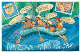
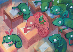

While I'm not sure I have the color palettes down, there is something about the deeper range of values that I like. I've been boldly painting dark washes over the whole paper, then pulling out highlights afterwards. The one obstacle right now is using white gouache to mix with other colors in my palette. Perhaps I'll get a better effect from buying the specific gouache oranges, blues and greens. If anyone has gouache expertise, I'd love to know how you use them. 

As an artist, it is our job to embrace that inner tug to explore a new direction. We may not be entirely pleased with the outcome right away. But with time and practice, and a bit of bravery, we may find a whole new visual voice that outshines the previous portfolio. 

Challenge yourself to try something new until it works. That's what I plan to do with this new direction. Stay tuned to see where it goes!
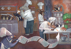


RENATO AND THE LION (Viking Children's Books)
by Barbara DiLorenzo
Now booking author visits for 2017-2018!

by Barbara DiLorenzo
To be released on April 3, 2018!

Barbara is represented by Rachel Orr of the Prospect Agency.
Twitter: @wavepaint
Facebook: @BarbaraWillcoxDiLorenzo


Wednesday, October 11, 2017

Illustrator Promo Sheets by Diana Ting Delosh

Promo pages, Promo sheets, Tear sheets. Whatever. They're a letter sized sample sheet of your illustration. Handy as hand outs whenever you have an  in person opportunity. Park them on your website where art directors/editors/art buyers can view or download  and print. Send the PDF out in e-mails. Change them up as often as you like.

What goes on a promo sheet? Current work and your contact info. The minimum is your name and website. More than that is up to your discretion and how much room you have on your sheet. I personally prefer just my website, maybe my e-mail IF it looks good. I may put more if I'm giving it to someone specific. Artfully design it or keep it simple and clean. I create mine in INDesign or Photoshop.

Make 2 templates: Vertical and Horizontal. The better to fit your art needs
No, they don't take the place of postcards. You do plan on doing at least one postcard mailing a year, right? However, they do have a few advantages over postcards. You can change them up as needed. There's no  minimum print order. No waiting for delivery. You can print them out at home in the middle of the night. Or if you're fussy or your printer has run out of ink, take your PDF Files to your local Staples/ FedEx and print out only what you need. 
Flip through the Directory pages on CBIG
 http://cbig-nyc.com/2017/2017-illustration-directories/

I am a co-president of CBIG, the Children's Book Illustrator Group and one of my projects is the CBIG Illustrator Directories. Basically they're a collection of Promo Pages from our participating members. One of the things, I love about the project is that I get inspired by all the art and the different ways to design a promo page. Take a peek, get inspired, and create your own.
Flip through the Directory pages on CBIG
 http://cbig-nyc.com/2017/2017-illustration-directories/

Twitter: dtdelosh

For your picture book storyboarding process
Check out: 
The BIG ThumbNailer
ThumbNailer

Wednesday, October 4, 2017

Freelance and Isolation - by Deborah Cuneo


Isolation is simply a given for a freelance creative. I really do spend the majority of my waking hours in my studio, by myself. And while my dog and cat are always happy to keep me company, neither one is much of a conversationalist!


My Studio Buddies...guess who's the Alpha!


Whether I'm cleaning up a piece of art, gathering materials or even just need to stand up and walk away from what I'm working on for 15 minutes, I can always make a phone call and get some human interaction. The rest of the time, I'm concentrating and interaction with anything other than what I'm working on, is just not possible. That's when I turn to the internet!


Working on Character Sheets


Since I've been freelancing for quite a few years, I've had the pleasure of listening to tons of  music, pod casts, talks and interviews on many different topics, as I work. As with anything, I've discovered some are good, some not so good and some are standouts to me.  I've also discovered that I've become a bit of a Ted Talk junkie! Below are a few interesting talks (somewhat relevant to our field) that I've listened to over the years and thought I'd share. 

Disclaimer...I just want to point out that my intention by sharing these, is not to force anyone to subscribe to a certain way of thinking. I listen to these talks simply for an interesting human voice in all those hours of creative solitude. For me, whether I agree with everything they've said or not, I find these make me think and in the end, there is always something positive to take away from it. If you choose to listen to them as well, I hope you'll do so in that same vein!


 I'd love to hear your thoughts on these and please feel free to share any talks or podcasts that you've enjoyed. I'm always up for some new things to listen to while I create! (You can put your suggestions in the comment section of this post.)

Enjoy!


Blog: Creating Out Loud  deborahcuneo.blogspot.com
Twitter: @debcuneoart 
 Instagram: @ataleof2studios